How to Navigate the Cosmos Network
A guide to keeping up with a network that aims to grow beyond millions of blockchains
Hey DEFI TIMES community,
Crypto isn’t the small community it used to be in 2017.
It has grown far beyond our expectations with thousands of communities - each of them having its own language and their own culture.
One of these communities is Cosmos - a network of many different blockchains, which have their own communication standard (IBC).
The Cosmos community wouldn’t be the same without one of the most important tools: Map of Zones.
If you are a Cosmos & IBC enthusiast (like me), you probably have heard of it already. It’s basically a visualization tool to monitor the internet of blockchains. Cosmos is at a point where it’s hard to keep track of everything that is going on.
So it’s more important than ever to have a simple tool tracking the role of each zone in the network.
Which blockchain has recently enabled IBC? Which one is next?
How many IBC transfers have been processed over the last 30 days... or in the last 24 hours?
These are the questions that Map of Zones tries to answer.
Just as Coinmarketcap was critical for the crypto industry to keep track of all existing coins, we need a solution to monitor the development of the internet of blockchains.
Let’s explore this exciting new tool!
📺 Watch our recent YouTube video about UMEE!
What is Map of Zones?
Map of Zones is a Cosmos network explorer that visualizes the internet of blockchains. A good way to imagine the tool is the following: It’s basically the Coinmarketcap for blockchains.
Think about the early times of Bitcoin for a second. When the first “altcoins” came up, it was very hard to keep track of every new coin popping up. That’s why people needed an updated list to get an overview of the crypto ecosystem.
The same thing is happening in Cosmos at the moment. Each week, there’s a new chain enabling IBC and connecting to the Cosmos network.
Map of zones is currently the best way to keep track of this insane growth.
Coinmarketcap solved the problem of visualizing the great variety of different coins popping up. Map of Zones basically does the same thing for chains that enabled IBC.
Now that we know what Map of Zones is all about, let’s explore the different features of this new and powerful tool.
Thanks to our sponsor MetaGameHub DAO!
What is MetaGameHub DAO?
Currently, it is very hard to value NFTs. MGH DAO tries to tackle this problem by:
providing NFT pools (investors do not have to pick single NFTs for their portfolios anymore)
providing an NFT Price Oracle that ensures transparent NFT valuations through the implementation of machine learning, big data, and smart contracts
Are you interested in learning more about MGH?
Key Components of Map of Zones
1. Visualization of IBC enabled chains
As discussed above, Map of Zones lists all chains that have integrated the Inter Blockchain Communication Protocol (IBC). IBC is a protocol that easily allows blockchains to talk to each other. It’s a standardized protocol for blockchain communication.
It solves one of the most important problems in crypto because it removes the need to build new token bridges from scratch. As we’ve seen several times in the past, unsafe token bridges were the reason for multiple multi-million dollar hacks. IBC tries to minimize these risks by introducing a battle-tested token bridge that is easy to adopt.
Map of Zones has specialized in visualizing all chains that have implemented IBC.
Just click on each zone in the network to view different IBC related stats like the number of IBC transfers, IBC share in %, etc.
2. View IBC statistics Per Zone
Once it’s clear, which zones exist in the network, Map of Zones lets you explore more details IBC related statistics.
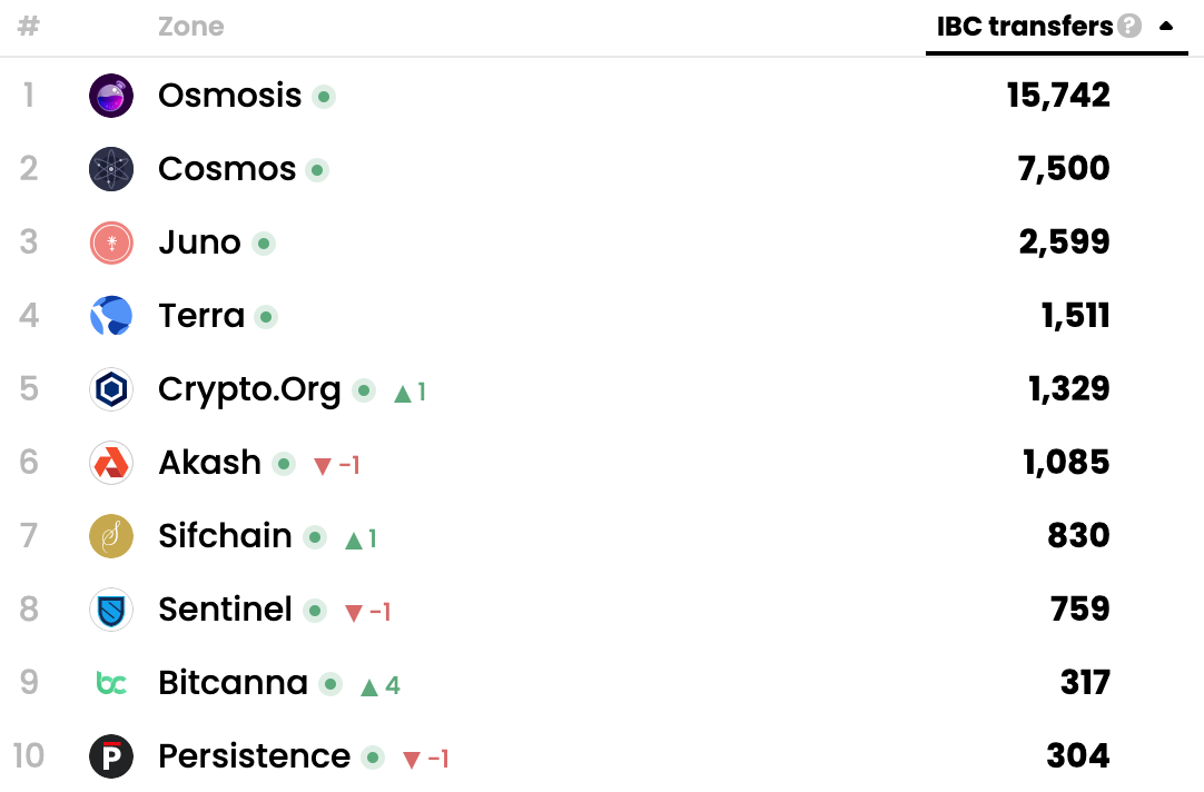
It also lists the most active chains in terms of the number of IBC transfers. As you can see, Osmosis has by far the most IBC transfers across the network. Please note that IBC transfers mean both in and out transfers. For example, both token transfers coming to Osmosis and coming from Osmosis to other chains count.
That’s why Map of Zones also shows the number of IBC transfers separately as in- and out-transfers. See Osmosis as an example: While Osmosis had 19,732 in the last 24 hours, only 8,989 of them were transactions coming from other chains to Osmosis.
3. Non-IBC Related Stats
Map of Zones also lets you navigate through other (non-IBC related stats), such as the number of total transactions per blockchain.
Terra is by far the largest chain in the network with hundreds of thousands of transactions per 24 hours.
Conclusion
Visualization tools are critical for humans to stay on top of all changes in a specific ecosystem.
Right now, Map of Zones is the only zone-tracking website in Cosmos. However, just as Coinmarketcap was the first coin-tracking tool and many more joined afterward, I expect many more tools to come as the Cosmos ecosystem grows.
Map of Zones definitely has the first-mover advantage and it’s on the best way to become the dominant Cosmos network explorer!
Find us on:
DISCLAIMER: All information presented above is meant for informational purposes only and should not be treated as financial, legal, or tax advice. This article's content solely reflects the opinion of the writer, who is not a financial advisor.
Do your own research before you purchase cryptocurrencies. Any cryptocurrency can go down in value. Holding cryptocurrencies is risky.


